2022 Group Exhibit, Documents: contemporary lens-based art Gallery 210 @ FAB, University of MO - St. Louis
untitled self-portrait
Artist statement:
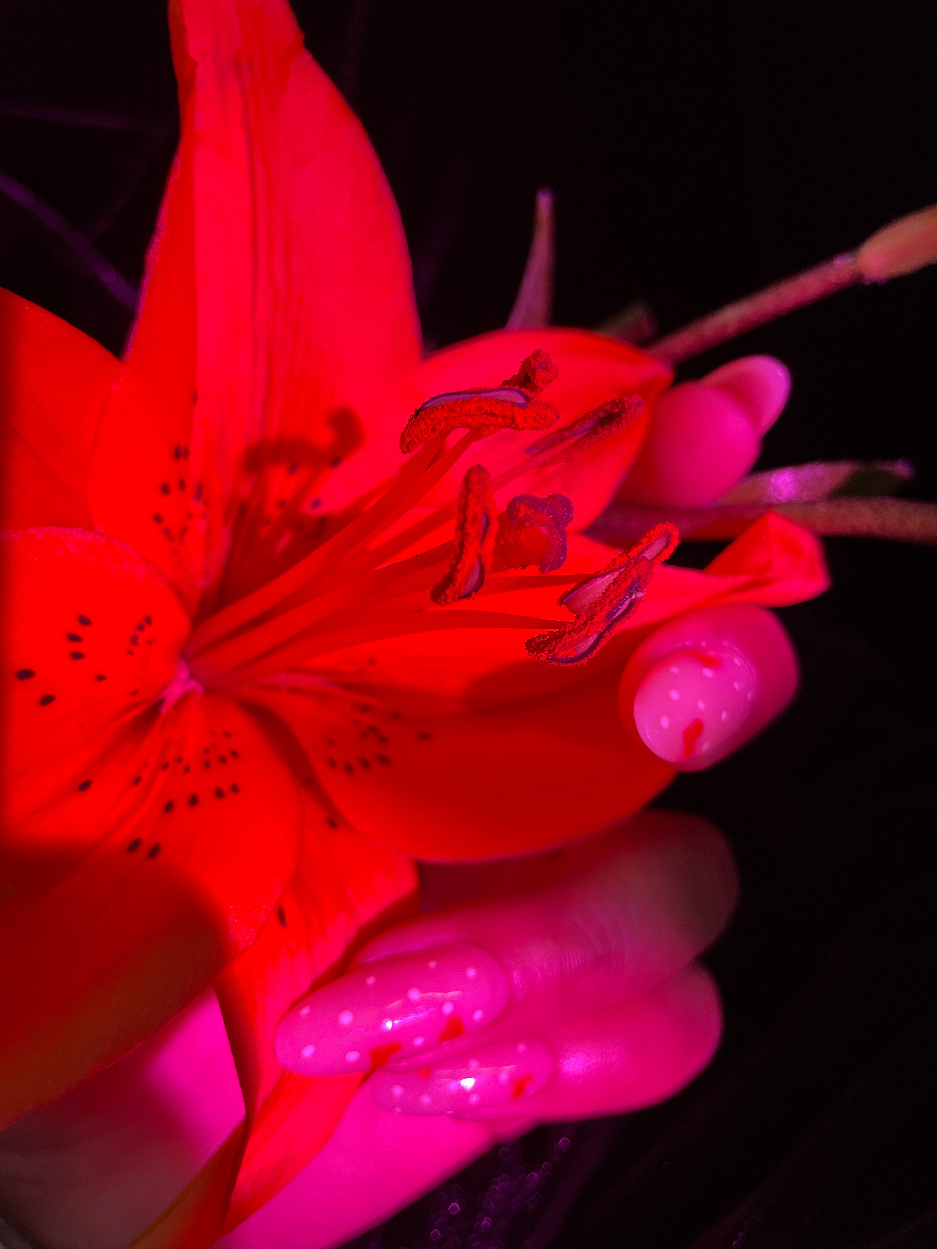
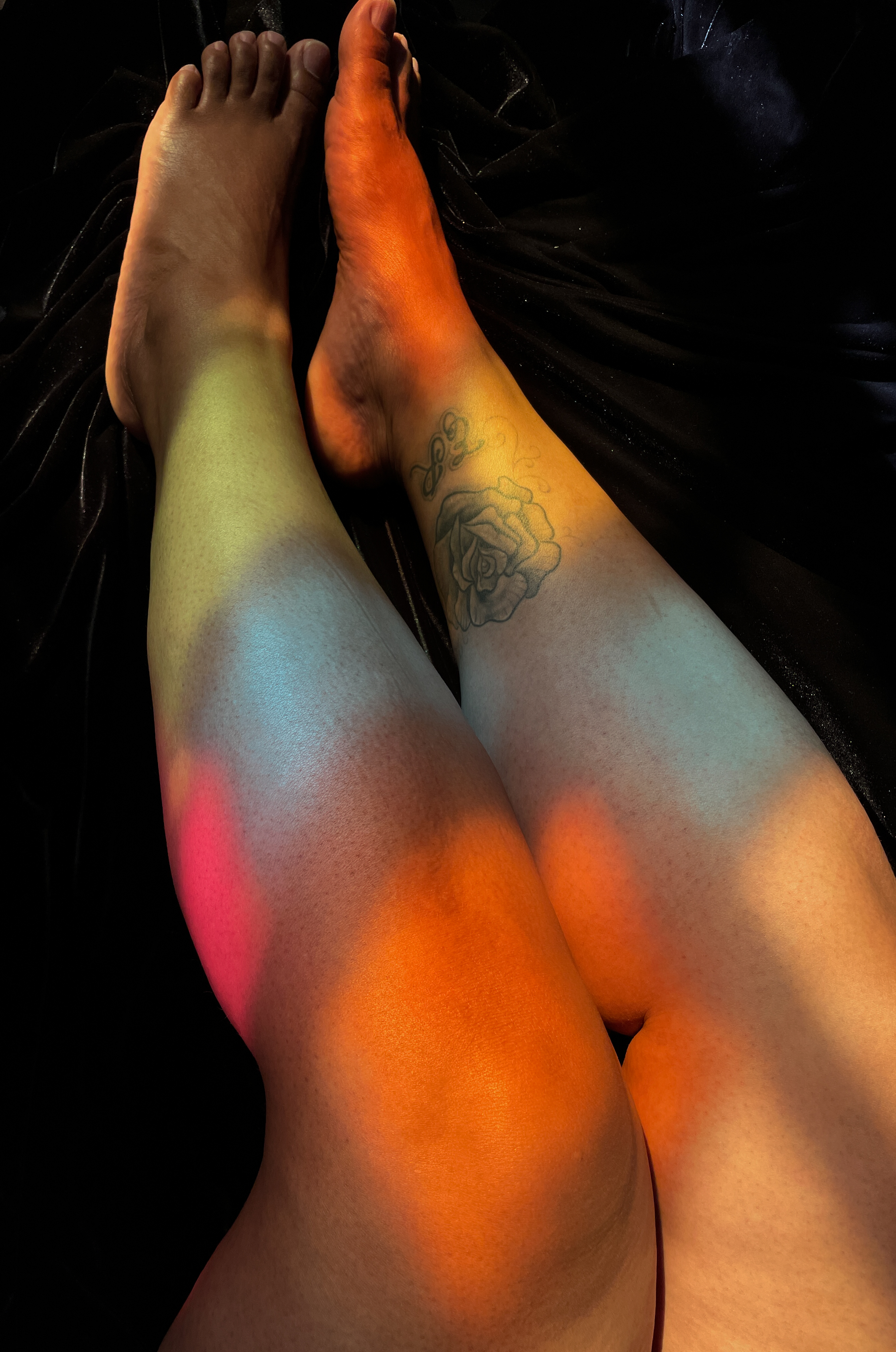
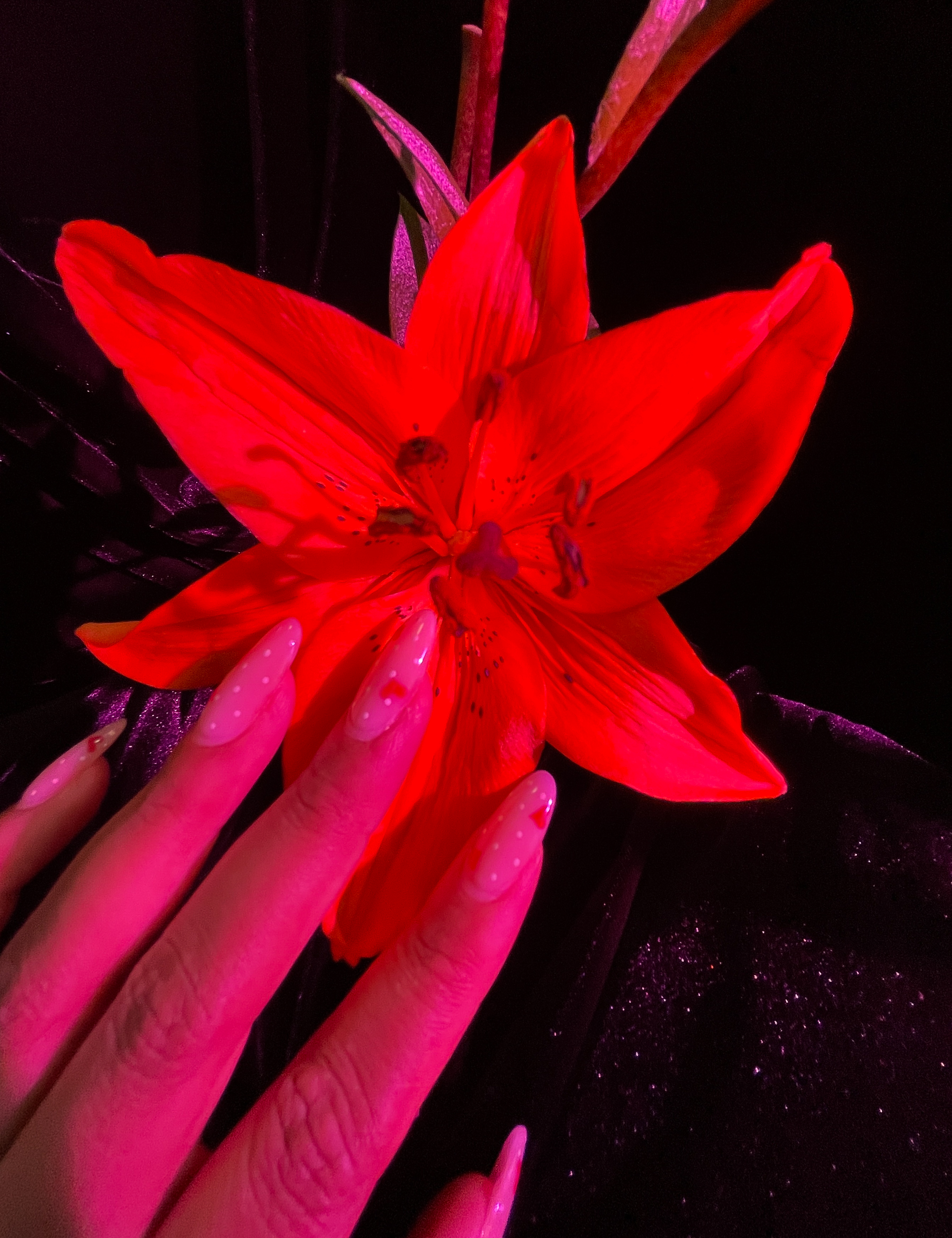
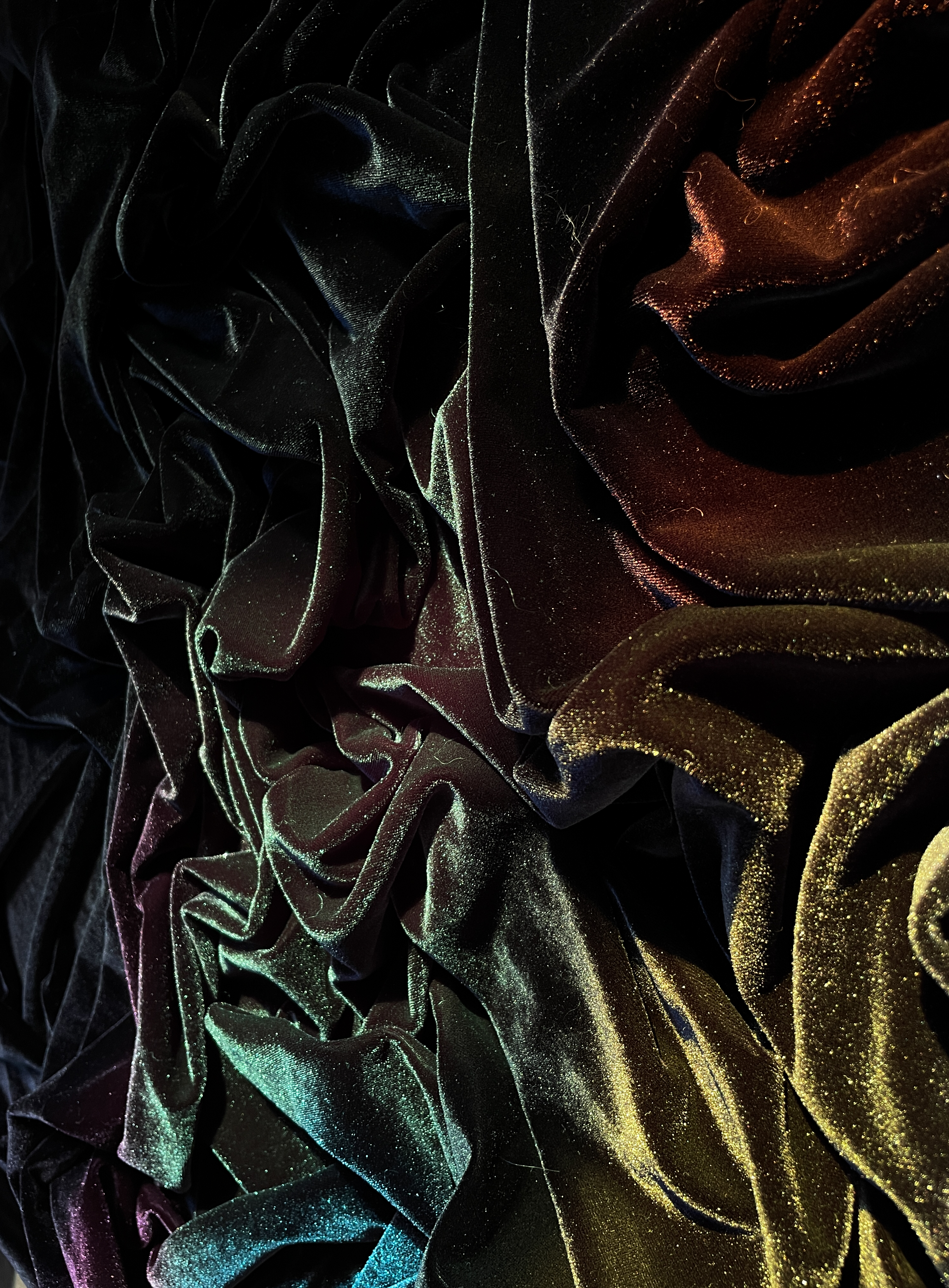
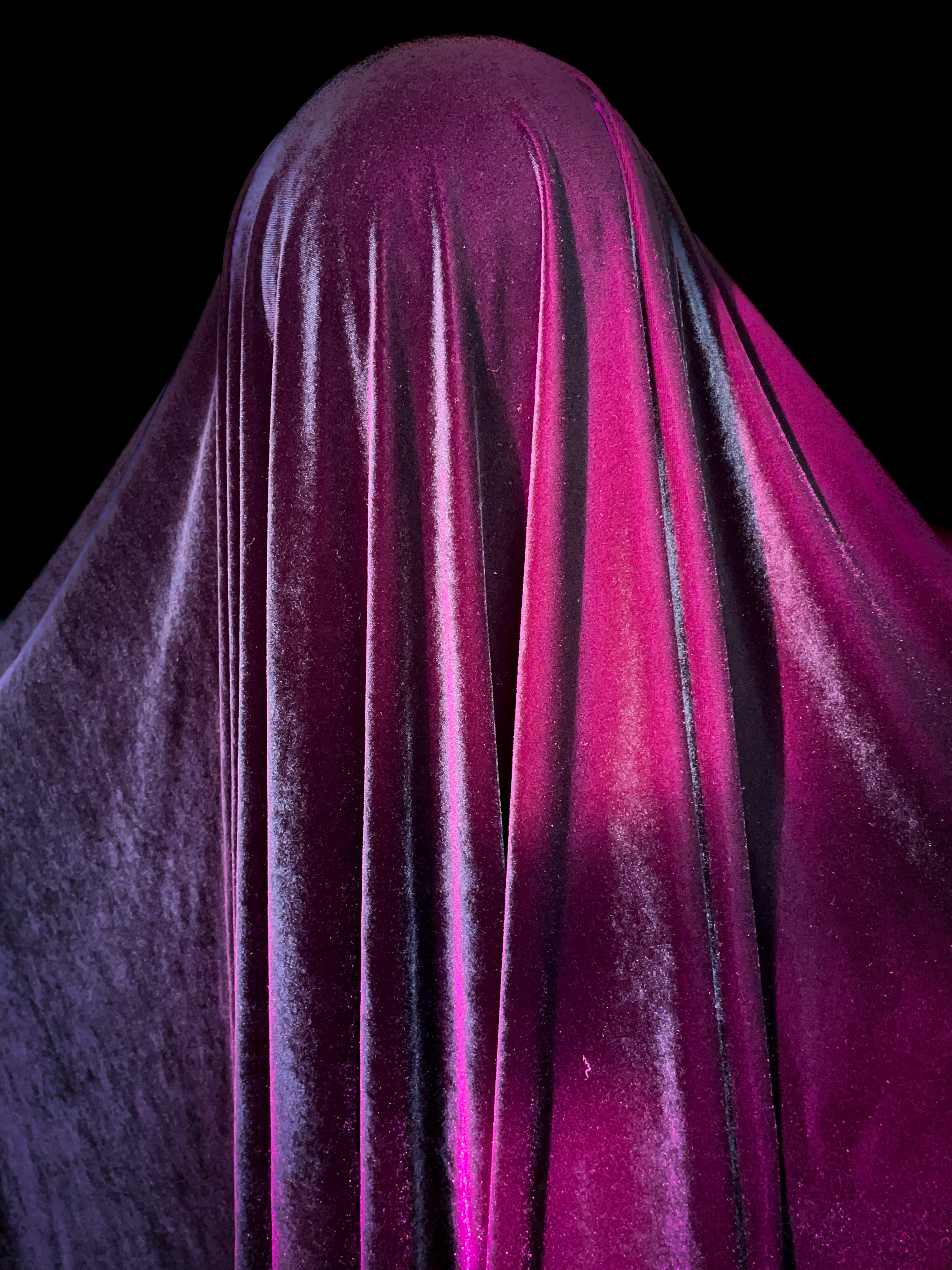
Colors are available to us to utilize in many forms. It is the psychology of colors that transforms them into a mechanism. Historically, colors and their significance have been pre-defined and determined for us. I refer to the Manchester Color Wheel, an emotion-based human design correlating hues with feelings. When employing natural light and colored cellophane, I can project emotion devoid of readied expression to invoke a tangibleness of internal thoughts or energy. A poignant reconstruction occurs within the viaducts of absorption and/or reflection, revealing a loss, gain, or blending of prisms that elicits a new bond or nexus with the self and ephemera.
Process: By hanging colored cellophane on the south-facing windows of my apartment, I am able to project emotion onto various ephemera devoid of any facial expression or immediate clue-ins to how I am feeling. The Manchester Color Wheel considers emotions as they relate to colors by asking subjects to identify and correlate a sensation or feeling with different hues. The study found that when associating sadness or down feelings rather than “feeling blue,” most subjects reported that they “feel grey.” The researchers queried subjects about other moods like happiness and found that people associated the color yellow with this feeling.
How can I utilize The Manchester Color Wheel to evoke how I’m feeling? Do I relate yellow to happiness? Do I relate grey to sadness? Is it possible to correlate a sensation to a color instead of a mood?